07 min read
Accessibility - who needs it? And why?
Accessibility - who needs it? And why?
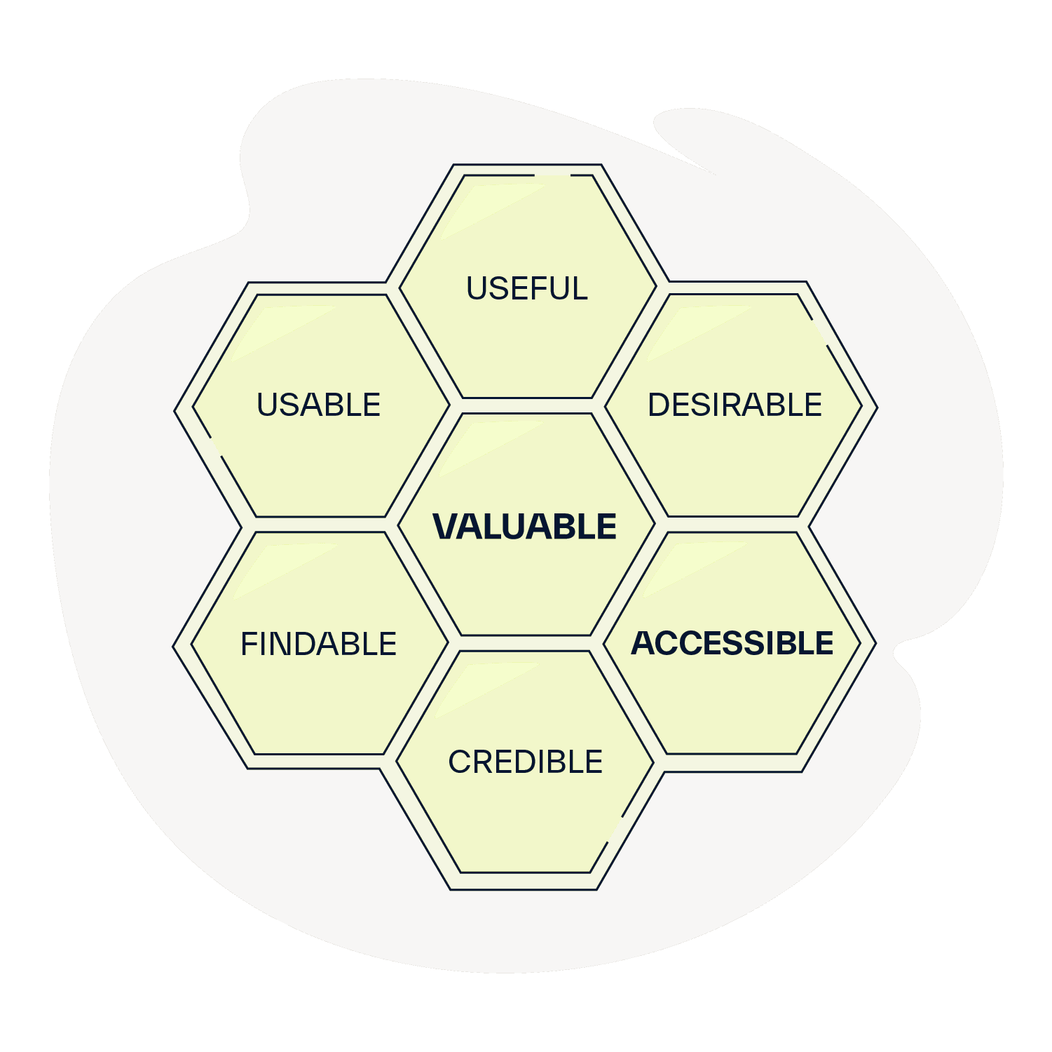
In recent years, there has been a frequent echo that we should design for accessibility, as ethics, empathy, reputation, and increasingly, the law demand it. I have the impression that the topic of digital product accessibility has grown into something monumental, seen as expensive and challenging to implement in practice. Designers must fight and persuade stakeholders about the benefits (expanding the potential customer base, increasing user loyalty, Brand Equity, positive impact on SEO). Yet, accessibility is fundamental to UX, just like findable, credible, desirable, useful, usable, valuable usability. Amidst the multitude of tools, impressive visual effects, gadgets, and the fervor of the fight, we forget that our role is to serve our users, solve their problems, and provide value, rather than overloading them with features, special effects, and glitter pouring out of the interface. Of course, such effects can bring a WOW effect when well applied, but this cannot be done without meeting the above. The entire team is responsible for accessibility, although I will write from the UX perspective, as that is my focus.
Accessibility - What does it actually mean?
It involves creating digital products in a way that enables practical access to information and interaction for everyone, regardless of physical and mental health and usage context, without excessive cognitive burden.
And why?
Because you don't have to be Sherlock Holmes to see that we're not getting any younger and cheerfully ruining our health. When we think about people with disabilities, the first image that comes to mind is someone in a wheelchair or a person with a white cane and black sunglasses like a Kombi vocalist. Nothing could be further from the truth because EVERYONE benefits from accessible design. Besides, each of us may face temporary disabilities such as:
- Broken limb
- Psychotropic drugs affecting cognitive functions
- Diseases affecting cognitive functions (e.g., infections of the nervous system, vitamin deficiencies, diseases causing pressure on the brain, etc.).
Example of permanent, temporary and situational disability
Improvements will also benefit search engines (website positioning) and fully-abled individuals, e.g.:
- In places requiring silence (e.g., waiting rooms) or in loud environments (trams)
- With a damaged mouse/touchpad or sound (they navigate using the keyboard, read subtitles in movies)
- In places making it difficult to use the screen (e.g., in bright sunlight)
- With specific monitor settings or driver/screen damage (they may not see bright elements on a light background)
- Older individuals (e.g., issues with motor coordination and understanding texts)
- Individuals with ADHD or dyslexia (e.g., concentration problems related to flashing elements or page formatting, known as 'text walls')
- Less-educated individuals (e.g., issues understanding texts)
- Well-educated individuals (sometimes understanding the requirements for a European Union grant is at a doctoral level).
Challenges may also be faced by:
- Individuals with motor organ dysfunction (e.g., damaged upper limbs preventing mouse use)
- Individuals with cognitive disorders (e.g., degenerative diseases like Alzheimer's, Parkinson's, AIDS making text comprehension difficult. Similar problems may be encountered by individuals with intellectual disabilities.)
- Individuals with hearing impairments
- Individuals with visual impairments
The group facing issues related to visual impairment is highly diverse, leading to difficulties specific to each condition.
Within this group, there are individuals who are:
- Blind
- Visually impaired
- Deafblind
- With color recognition disorders
- It is also important to consider individuals with cross-disabilities, such as color recognition disorders and damaged upper limbs. We cannot predict the combination of dysfunctions.
How do people with disabilities use the Internet?
People with low vision enlarge or fully customize the view - fonts, colors, zoom, etc. Blind individuals and some with low vision use screen readers - the reader conveys much more than is visible if given the chance.
Those with cognitive limitations require clarity - and alternatives such as sign language interpreters or easy-read versions.
People with mobility restrictions navigate with just the keyboard, mouse, switch, voice, or mind - standards, focus visibility, and the size of clickable elements are crucial in facilitating this.
Several selected areas of accessibility according to WCAG 2.1
WCAG stands for Web Content Accessibility Guidelines, outlining the guidelines for making web content accessible. These standards specify **how to create digital products so that people with limited abilities, whether permanent or temporary, can use them without constraints. **
The current WCAG 2.1 primarily relies on four principles: perceivability, operability, understandability, and robustness.
-
Alternative for non-text content (graphics, charts, maps, videos, etc.) - Alt attribute describing the image, captions, transcription, audio description.
-
Visibility and logical focus order - always know where I am navigating with the keyboard.
-
Status information - sounds familiar, doesn't it? ;)
-
Zoom capability - never block scaling.
-
Contrast of content to background - also of significant graphic elements.
-
Logical structure - division into sections, headers, lists.
-
Appropriate size of clickable elements - because not everyone is a Counter-Strike master.
-
Understandability - at least at the FOG 11 level. FOG index of readability was designed to determine the degree of text accessibility. Its value represents the number of years of education needed to understand the text. 11 indicates fairly simple language, understandable for high school students.
-
The page should not contain anything that flickers more than three times per second - the interface is not Manieczki 2000 with white gloves and stroboscopes flashing in your eyes. It can cause an epileptic seizure. (After one episode of the animated Pokemon series, about 700 children in Japan had epileptic seizures and were hospitalized.)
-
Link purpose (in context) - the purpose of the link should be evident from the link itself. Often, there are many links named "more." A blind user cannot understand where they lead. Such a link should have additional text about its purpose (e.g., hidden using CSS).
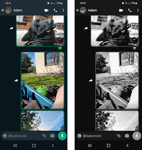
For color blindness, there is a difference, isn't there?
WCAG 2.1 / 1.4.1 – Use of Color - Information should not be conveyed based solely on color, as WhatsApp shows message status (blue arrows for read, white for delivered).
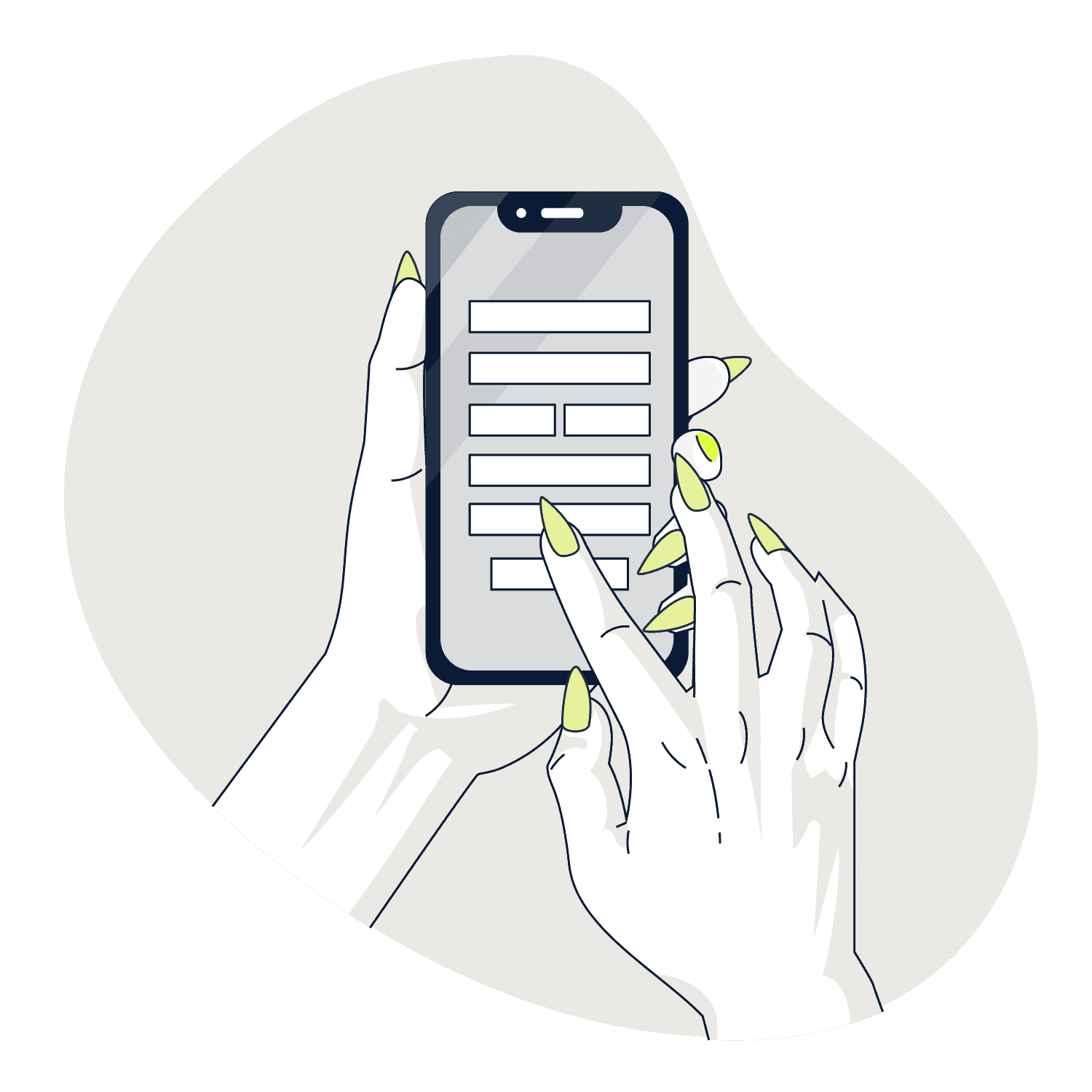
Appropriate size of elements will also be appreciated by individuals with long nails.
But how to go about it?
Largely, adhering to usability principles positively influences accessibility.
There are many sources to learn about accessibility, such as WCAG, a set of guidelines that can be cognitively challenging for beginners. It's best to see how people with limitations use interfaces, try out screen readers (VoiceOver for Mac, Narrator for Windows) to partially understand that experience. Recommended books include 'Nie przedstawię się państwu na ulicy' ('I will not introduce myself to you on the street') by Maria Reimann and 'Accessibility for Everyone' by Laura Kalbag. To check text comprehensibility - jasnopis (in Polish) and Hemingway (in English) come in handy. Of course, there are many tools and plugins, but beware—they check the technical side of code compliance with standards, so they don't guarantee practical accessibility. Only TESTING with real people is the solution.
How to Test Accessibility?
Testing accessibility is akin to usability testing, with the key difference that visual prototypes may fall short for screen reader evaluations. Participants are harder to recruit, potentially resulting in smaller sample sizes. It involves more free-flowing methods, emphasizing participant observation. Consider that participants may fatigue quickly, and tests take place on their own devices, typically at home, requiring researchers to reach them. At the end of the day, repeating patterns may not emerge, but understanding what works and what doesn't is still valuable.
Responsibility in the Design Team
In the design team, responsibility for accessibility often gets tossed around like a hot potato. It should be a team effort from the beginning to avoid creating technological debt. The UX designer should ensure the interface solves problems, is useful, logical, and sensible. The UX or content writer should craft understandable texts using plain language. The UI designer should focus on appropriate contrasts, spacing, typography, and font sizes. Developers, on the other hand, need to ensure semantic code supported by accessibility technology.
Key Takeaway
The biggest challenge in accessibility isn't just low contrasts or keyboard compatibility issues but our tendency to get carried away with fancy designs, overloading interfaces with animations, information, and gimmicks. Nothing impedes a user of accessibility technology more than cognitive overload. Thus, start by identifying the problem you want to solve, think, and eliminate unnecessary elements.
Design as if you were creating something for your parents and grandparents or for yourself in 30 years.
Share article
Joanna Bałdyga
UX Designer


